
We gave the monitor view a redesign
Have you ever done something so logical that you thought, “Why didn’t I think of this earlier?” That’s how we feel about our complete redesign this month. We added a secondary navigation menu in Semonto that makes it so much easier to navigate between the different settings and features of a selected monitor.
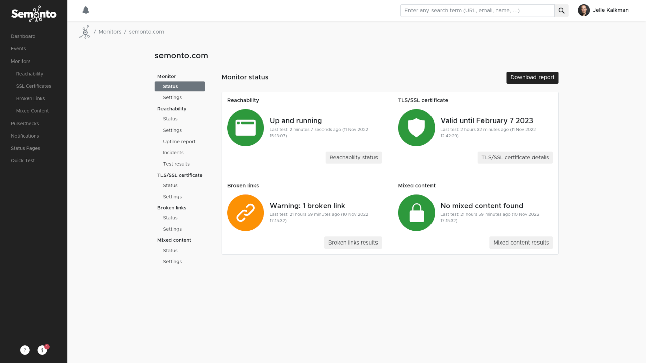
What it was like before: many levels deep
Over the last year, we added many new features to Semonto, like scanning for broken links and dedicated SSL monitoring. But that came with a downside: you sometimes had to click two or three levels deep before reaching the exact status or setting you wanted. So we decided to organize the information differently.
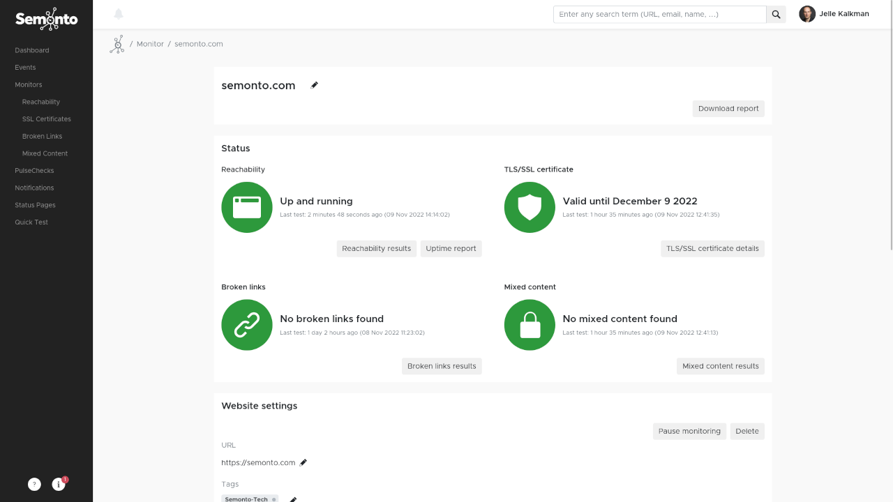
What it is like now: accessible in one click
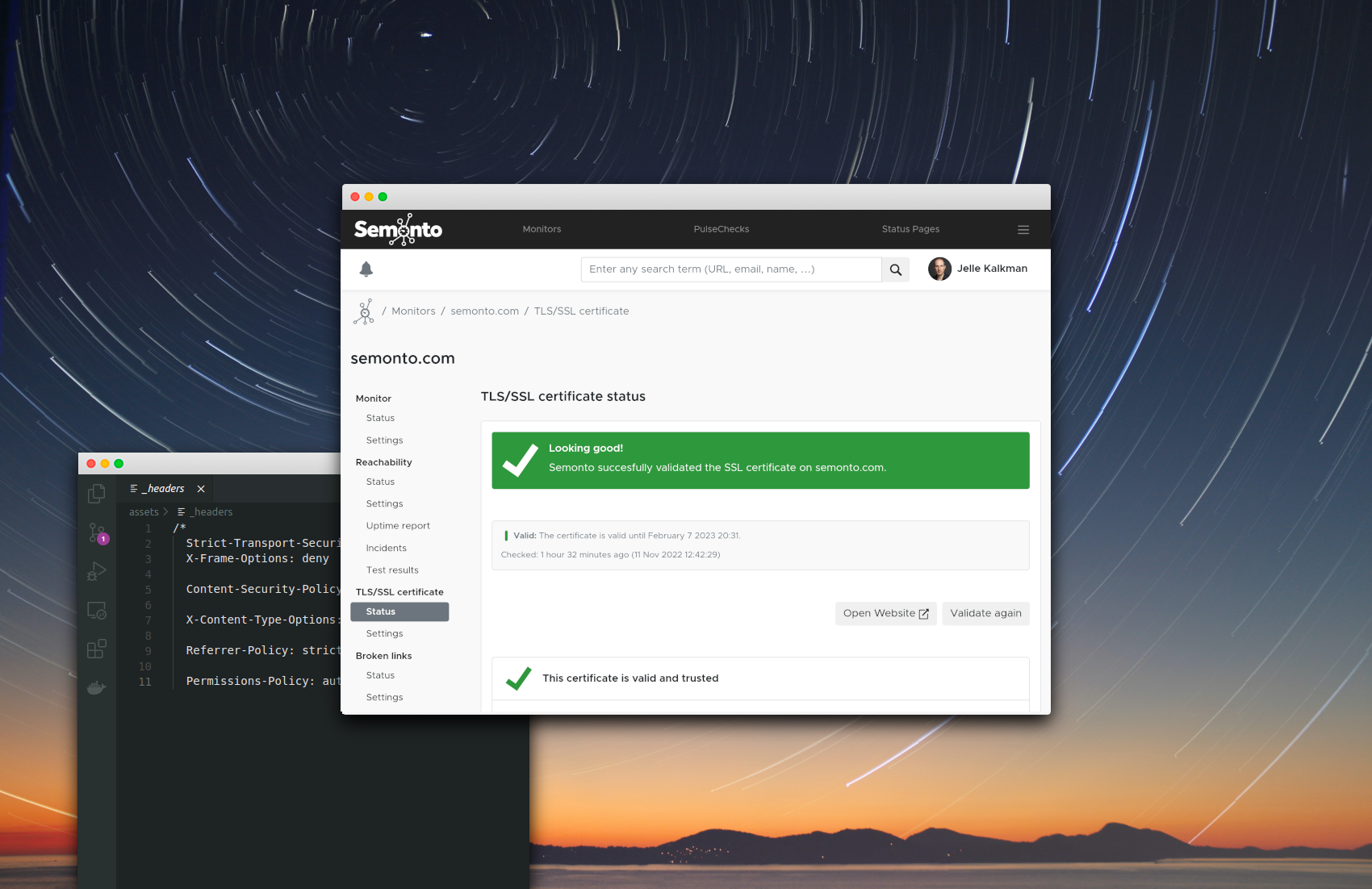
We have added a second navigation menu in Semonto. It pops open when you select the website you are monitoring. The menu shows you all the tests that are available for this monitor. You can go straight to the results, status, or settings in one click. Easy, right?
What do you think?
We are very excited about this improvement and hope you are, too! Please feel free to let us know your comments. We love getting feedback from our community. You can send us a message through our contact page.
Have fun monitoring!
Latest blogs
Tips and Tricks
How to Monitor Broken Links: 12 SEO Best Practices (2026)
Tips and Tricks
Monitoring Short-Lived TLS Certificates with Semonto

Tips and Tricks