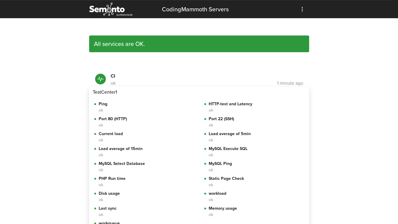
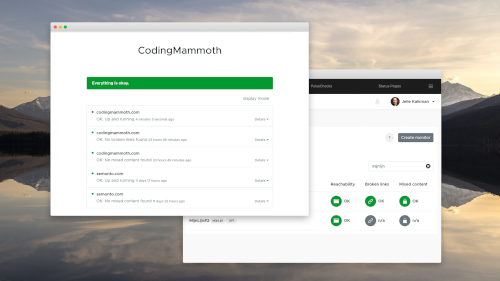
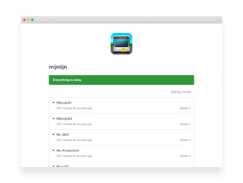
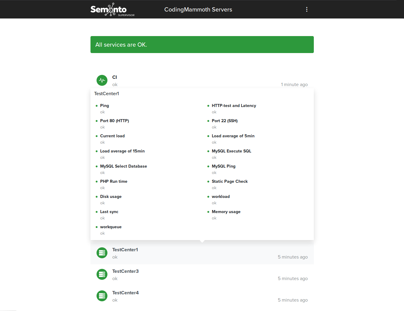
We released Semonto 3.5 today. Besides a lot of work under the hood we improved the overall design of the status pages. Status pages are sorted now alphabetically and more important on the state of the items shown, items in error state are shown on top. We also decided to show the details of a monitor in a hover providing a better user experience than expanding lists.
We hope you like it! Feel free to report any issues you experience with this version or suggestions how to improve our product.
