Contents
What does a 404 page typically look like?
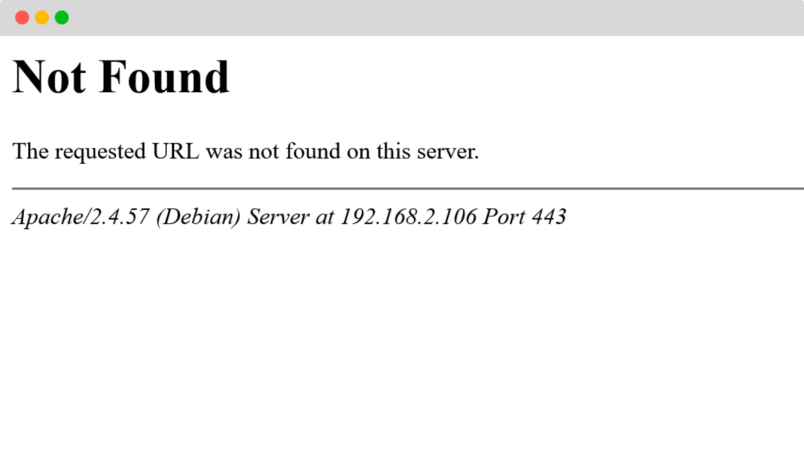
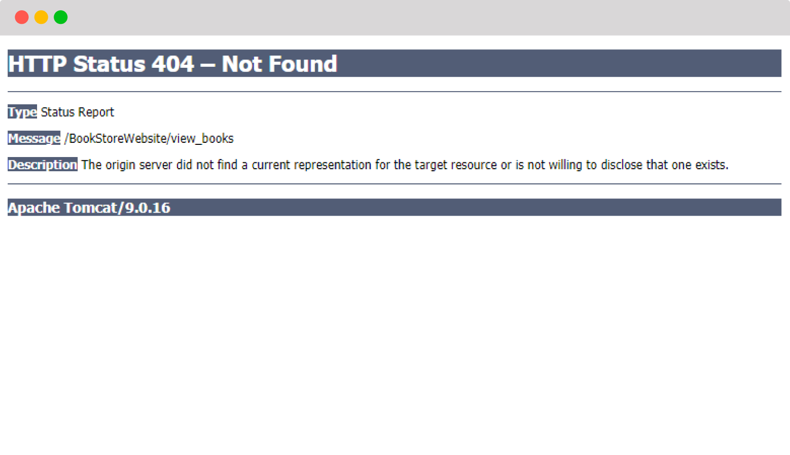
By default, a 404 page is quite boring and empty. It’s generated by the web server software. If you do not tweak it yourself, it will look something like this: This article is part of The ultimate guide to 404 pages.
Apache 404 page:
Tomcat 404 page:
Nginx 404 page:

6 ways to make your 404 page better
As you can see from the examples, there are plenty of ways to make your 404 page better. You can make it fit your branding, improve the copywriting, and make several usability improvements to lower your web visitors’ frustration. We have made a list of 6 thinks you can immediately implement to make your 404 page stand out.
1. Make it visually more appealing
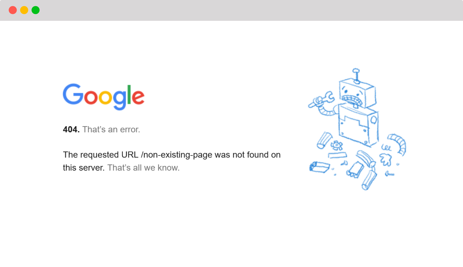
Let’s start with the basics. The least you want to do is make the page look like the rest of your web pages. In other words, you want to apply your own branding. This can be done via a config setting of your web server and can often be set via a .htaccess file. If you do not have the skills to do this yourself, ask the web developer who built your website.
For example, this is the Google 404 page:
2. Make the message easier to understand
Not everyone knows what HTTP 404 means, so you can help your visitors understand what they are looking at by adding easy-to-understand language.
Possible HTTP 404 messages that you can use are:
- "Oops! The page you're looking for can't be found."
- "Sorry, we couldn't find the page you were trying to visit."
- "It looks like this page doesn't exist."
- "The link you clicked might be broken or the page has been moved."
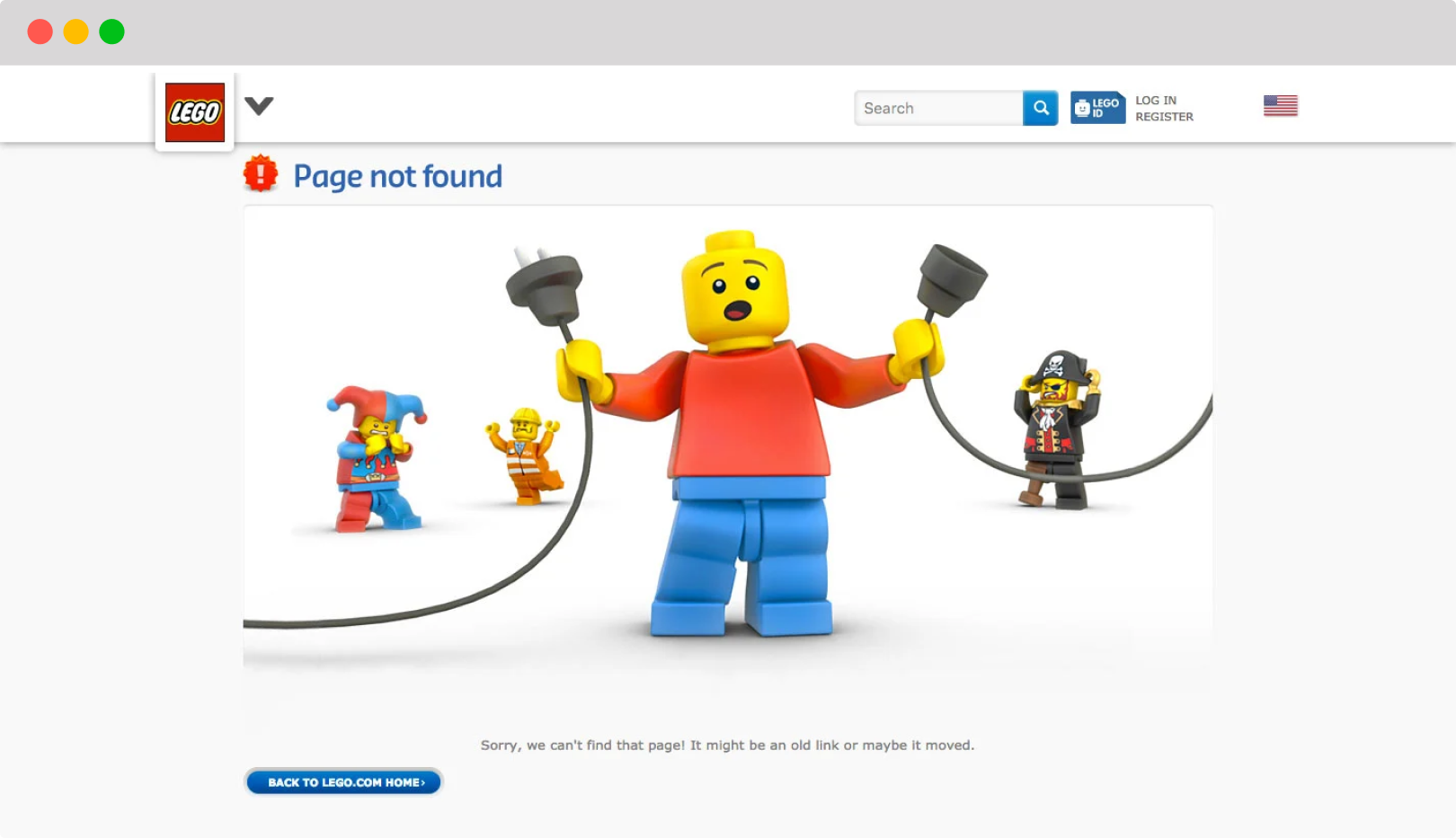
3. Optional: add a bit of fun
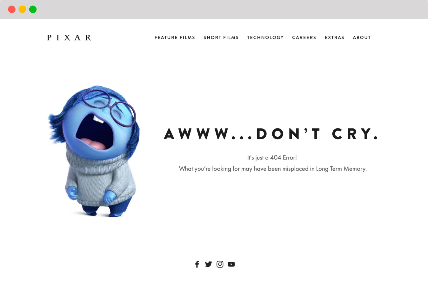
Some people make their HTTP 404 page entertaining by adding a cool quote or a striking visual. This can be a great way to apply your branding in a non-obvious way. Warning: do this only if it fits your company culture. If your organisation is very serious and official, a crazy 404 page could come across as inappropriate or inauthentic.
4. Add links to helpful pages
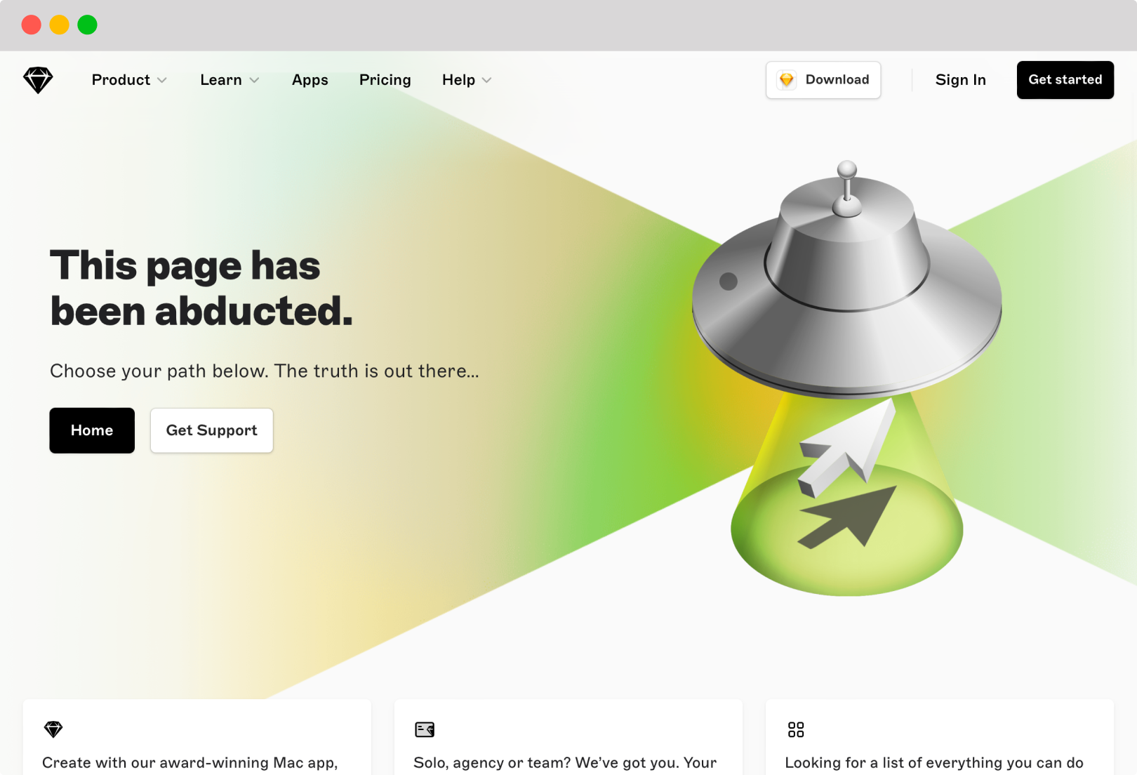
Making a 404 page look good is nice, but it does not solve the problem that your visitors are facing: they are looking for a web page and cannot find it. So if you really want to do them a service, you help them find their way. A way to be helpful is by directing them to pages that might be of value to them.
Links that you could add to your 404 page:
- A link to the FAQ
- An overview of the latest blog posts
- A sitemap
- Contact details
This is how Sketch is doing it:
5. Add a search bar
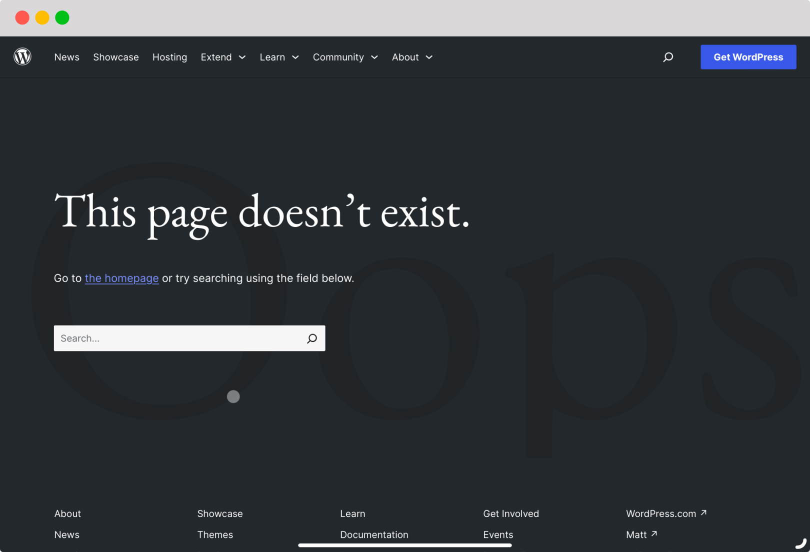
If your website has a search feature, why not include a search bar on your 404 page, so the website visitor can try to find what he was really looking for and continue his journey on your website.
This is how Wordpress.org is handles their 404 page:
6. Go the extra mile: guess which page they were looking for
The benefit of having a custom 404 page, is that you know which page or URL the user originally tried to request. Taking the name of the requested page into account, you can pre-fill the search bar, perform a search operation, and show the results. This saves the user an extra click.
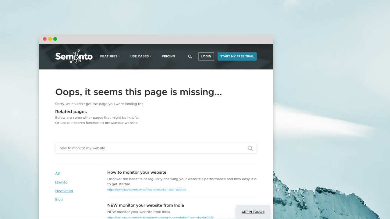
This is how we do it at Semonto. Our 404 page will pre-fill the search bar in the hope that the user will find a similar page as the requested page and is not at a dead end.
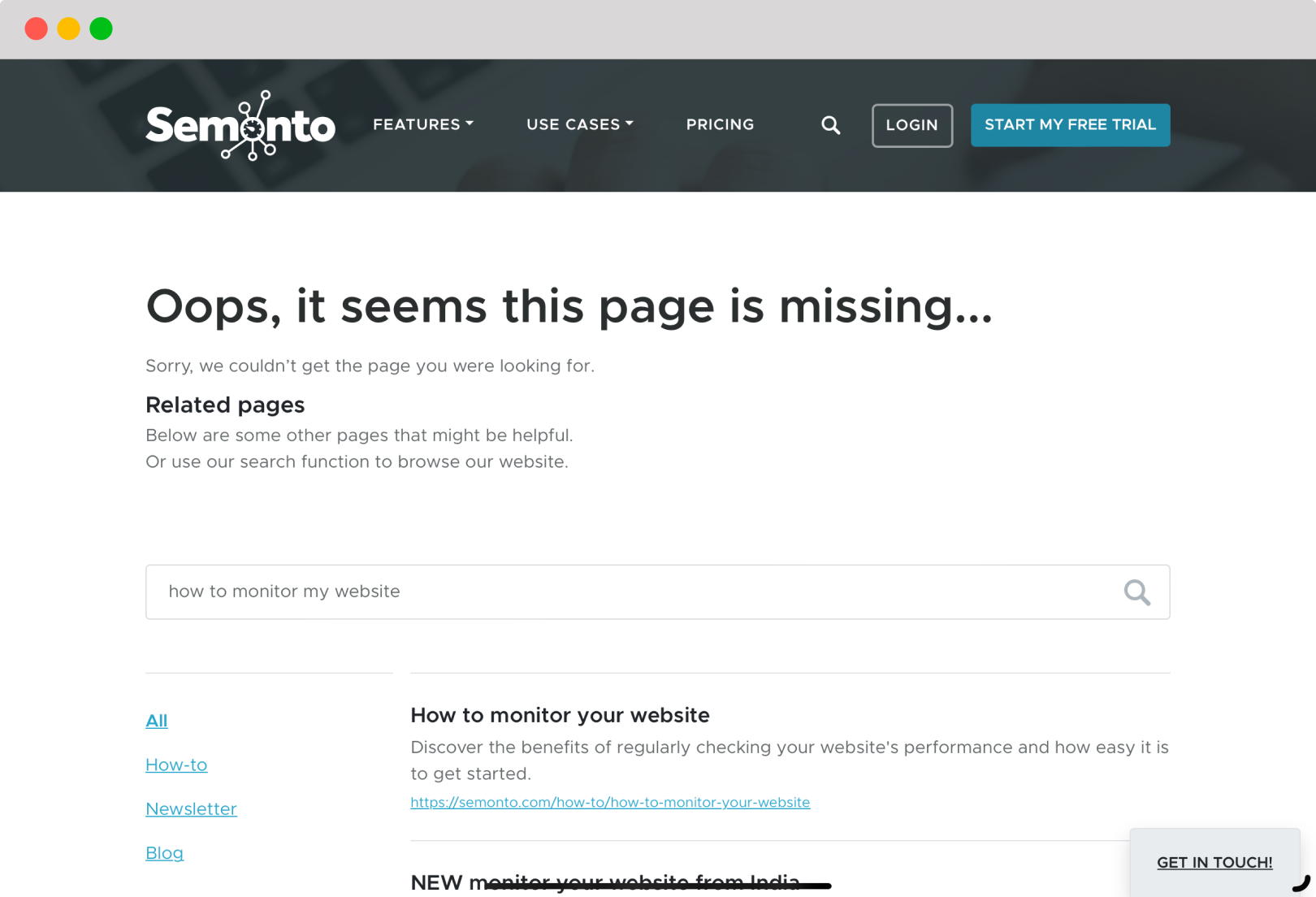
An alternative option is to redirect the user directly to the best match or similar pages. Personally, this is not our favourite as it can confuse users, even when an informative banner is shown indicating that the user was redirected.
Next: how to prevent errors on your website
It’s essential to make your 404 easy to understand. It’s even better to make the page useful and help visitors find their way to the resource they seek. However, a real website professional will make sure that 404 errors are avoided in the first place. That is what we will teach you in the next article.
Next article: How to prevent errors on your website
For ongoing detection and prioritization of broken links, also read How to Monitor Broken Links: 12 SEO Best Practices (2026).
